Impacting Charts for your Excel Templates.
When presenting the information to a boss the visual aspect is very important, if you want to highlight both positive aspects and aspects to improve in the company with your presentations, there is nothing better than impacting charts that add value to your communication.
Whether you make a presentation or create a report prepared in Word format, on many occasions you will have to show the company’s key indicators state.
If you really want to impact your boss or a customer with a good chart you will need professional templates.
What type of chart to choose for your Excel template, which you can use in PowerPoint presentations or Word reports?
This will depend on your needs, but here I leave you 4 types of charts that really impact and with which you will get the attention of your audience.
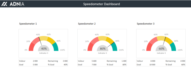
Speedometers Charts for Excel templates. Very easy to visualize since we are all used to the dashboards controls of the vehicles that indicate the speed, the rev counter, the fuel level … If you want to show high value indicators graphically this type of charts works very well.
Gauge Charts for Excel templates. Very similar to speedometer charts, this type of graphic is widely used in Dashboards and Balanced Scorecards, they can be one colour or several colours. They have the visual effect of a fuel pump at a gas service station, when the fuel pump is full or almost full the indicator is ok, if the content of the fuel pump falls below the set limit then the alarms jump.

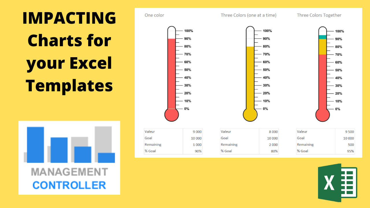
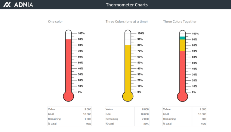
Temperature Thermometer Charts. Visually very attractive and impressive to measure the health of the company. Bosses love to see that all the indicators are green, so be careful with these graphics because the negative results attract too much attention. These graphics can be configured with a single colour, with the possibility of using up to 3 colours or using 3 colours simultaneously.
Evaluation and Positioning Chart. Ideal to compare 2 values and position them graphically for different data. For example, income vs. profitability, sales vs. growth, business scope vs. usability, growth rate vs. market share….

These are just a few examples of the many types of charts you can use to dazzle your presentations, to prepare the star report in your company or write a sales letter that amaze your customers.
Do you want to get these Charts for your Excel templates?
Press the next button and follow the instructions.
Press here to get these templates
More information about Controlling Tools
- Human Resources HR Budget Excel Template
- 3 Methods Selling Price Calculation Free Excel Template
- Contracts Control and Management Excel spreadsheet
- What is an Excel Action Plan template and how can it help you?
- Cash Flow Control M1 Free Excel Template
- Financial Plan M3 Free Excel Template
- Direct Costing Free Excel Template
- Plan, Do, Check and Act (PDCA) Excel Template
- How the Budget Control service works
- Management Accounting as a Control and Decision-Making Instrument
- How to Calculate Variable Costs and Identify Them
- Home Budget M2 Excel Template
- Cash Flow Vs Treasury Foecasts
- Payments Forecast Control FREE Excel Template
- Excel Template Matrix for Decisions
- Projects Work Plan Template Excel
- E-Commerce KPIs Control Excel Template
- Decisions Sale Price Lists Calculation Free Excel Template
- Cost Accounting. What benefits contribute to the company
- Employee Absences Free Excel Template
- Excel Templates Financial Dashboards Pack
- Inventory Control and Dashboard Excel Template
More Videos about Management Accounting
![]()

Industrial company financial manager
Dani is helping us to use ODOO more efficiently, we are rapidly leveling up with the ERP. It is also preparing us very useful analysis and control reports and outstanding management tools. Always available by phone or email, willing to help and collaborate in everything that is proposed. Very professional and fast work. A key service for our company.
Controlling Consultant
Controller ODOO ERP

Email: dani@cashtrainers.com